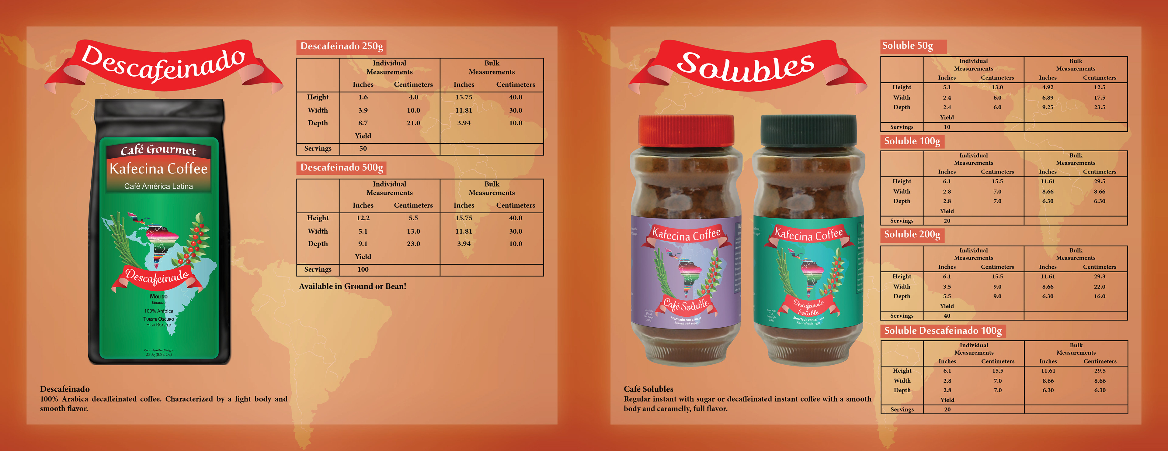
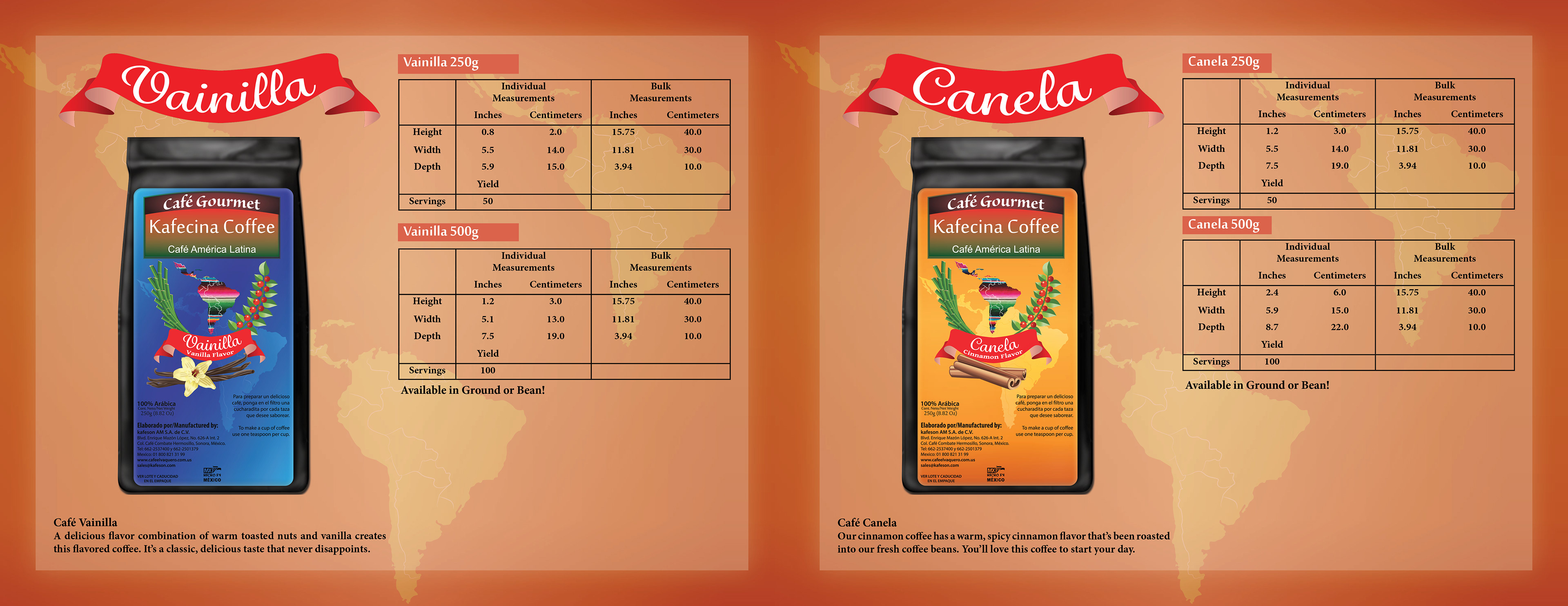
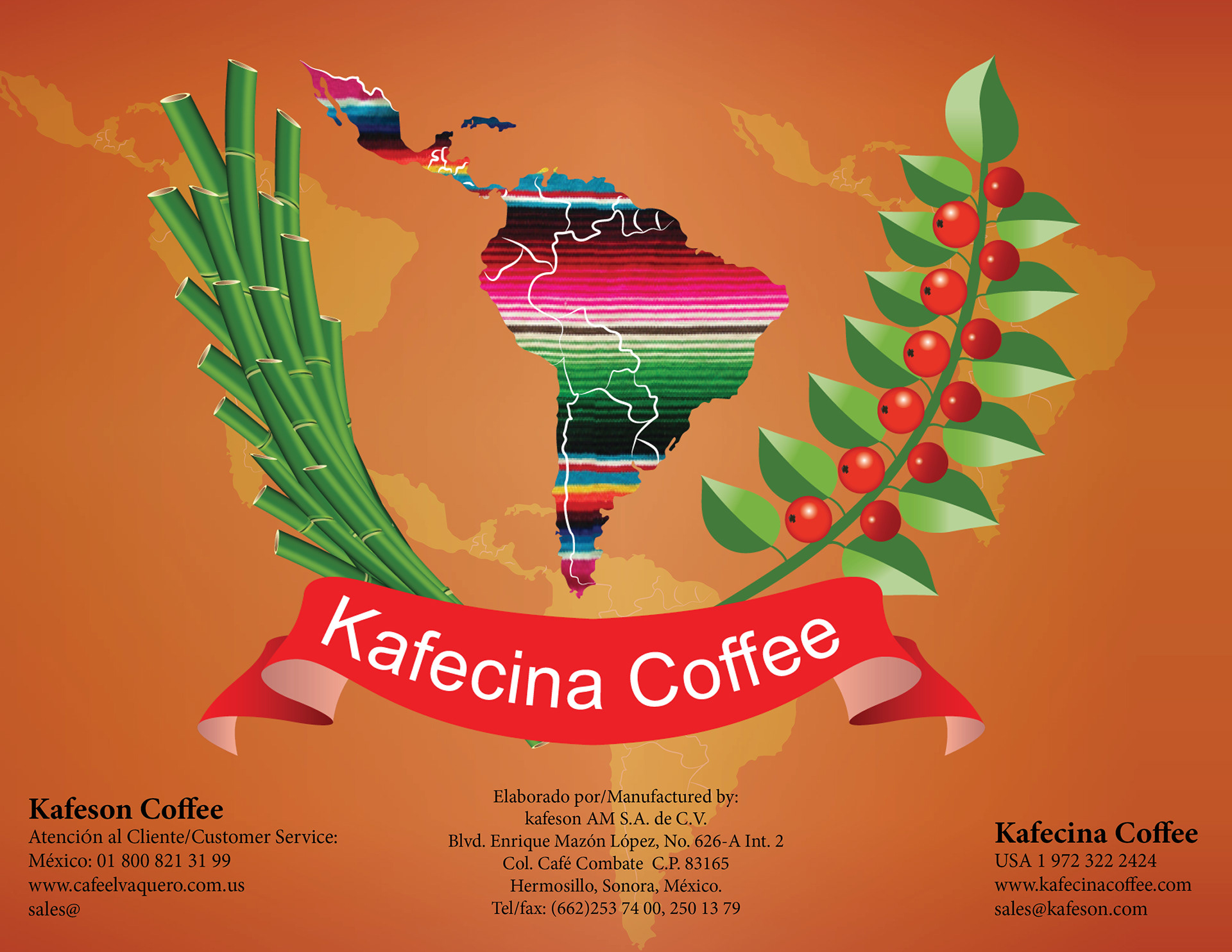
Kafecina Coffee balances the delicate flavor with a rich body for a never bitter cup. Kafecina wanted the feel of Latin America to shine through. Inspiration came from the pride of the company and paired with the fruit of their obsession. Since it all starts with the southern farms, they became the center of the logo. Then balance it with branches of coffee bean and cane sugar that are in the coffee.
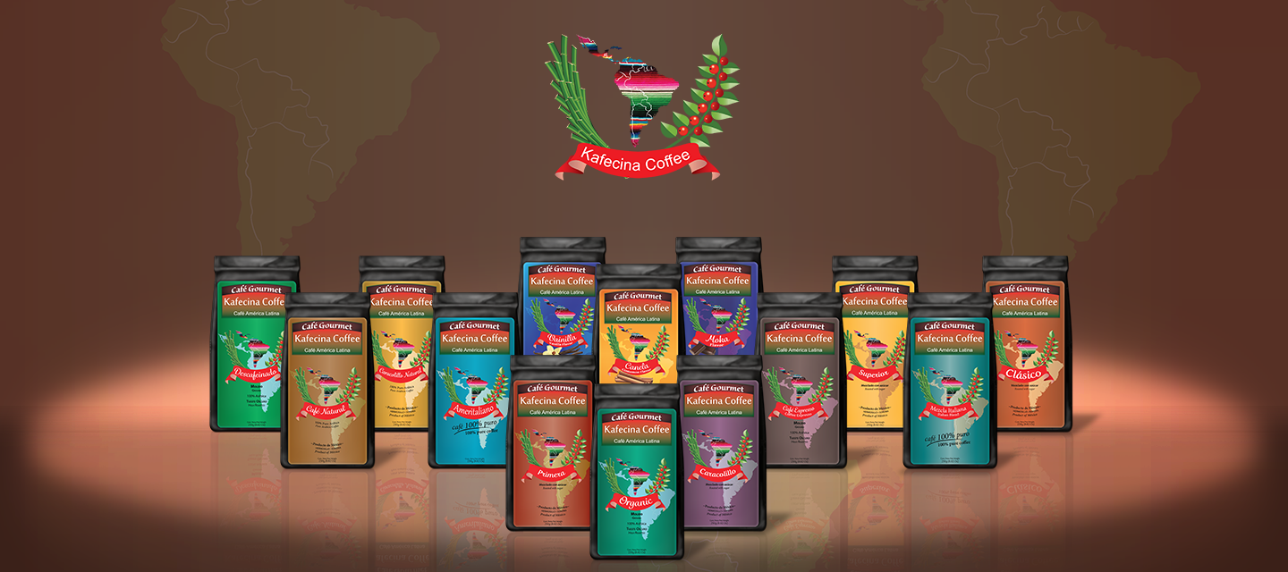
Each Kafecina label had its own persona like each sarapes have distinct colors. Kafecina wanted the colors to reflect the coffee characteristics.

Kafecina Coffee knew that coffee and herbs can unite. Instead of herbal teas why not herbal coffee! The leafy green unifies the whole herbal line.

Each thumbnail highlights the coffee beans which is the main star of the show.
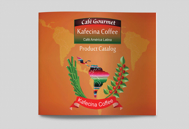
Kafecina catalog is flexible to print or to email potential clients.